Colourful street furniture: inspiration & smart choices for the public space
With considered colour choices, you can make streets, squares and parks recognisable and pleasant to use. Here you’ll find clear examples and practical insights you can apply right away — giving your public‑space project colour.
Summary
Discover how you can use colour in the public realm — from a local square to a shopping street, boulevard, campus, school‑yard or station zone — to create an environment that is readable, comfortable and recognisable. We show easily‑recognisable scenarios and a straightforward approach to selecting a colour plan or strategy that supports way‑finding, keeps seating cooler during warm weather and visually unifies your street furniture. At the end you’ll find direct links to our more technical‑and‑in‑depth pages on topics such as contrast, cooling and maintenance.
Why colour matters
Colour is more than just a coat of paint or an RAL code. In the public realm it determines how quickly people find their way, whether a square invites lingering, and whether different objects (benches, picnic tables, litter bins, bike parking) are perceived as a unified whole. A well‑chosen colour palette brings calm in busy environments and increases readability, by day and at dusk.
In addition, colour has a practical impact on comfort and maintenance. Light‑toned surfaces on seating make staying there more pleasant on hot days; consistent colour names and codes ensure that re‑orders and upkeep proceed smoothly. Make the leap from ambience to smart choices that work in today’s projects.
In our white paper “Colour that Performs” you’ll find exactly how to do this, plus a more technical approach and rationale for the use of colour in the public space.
Colour after sundown
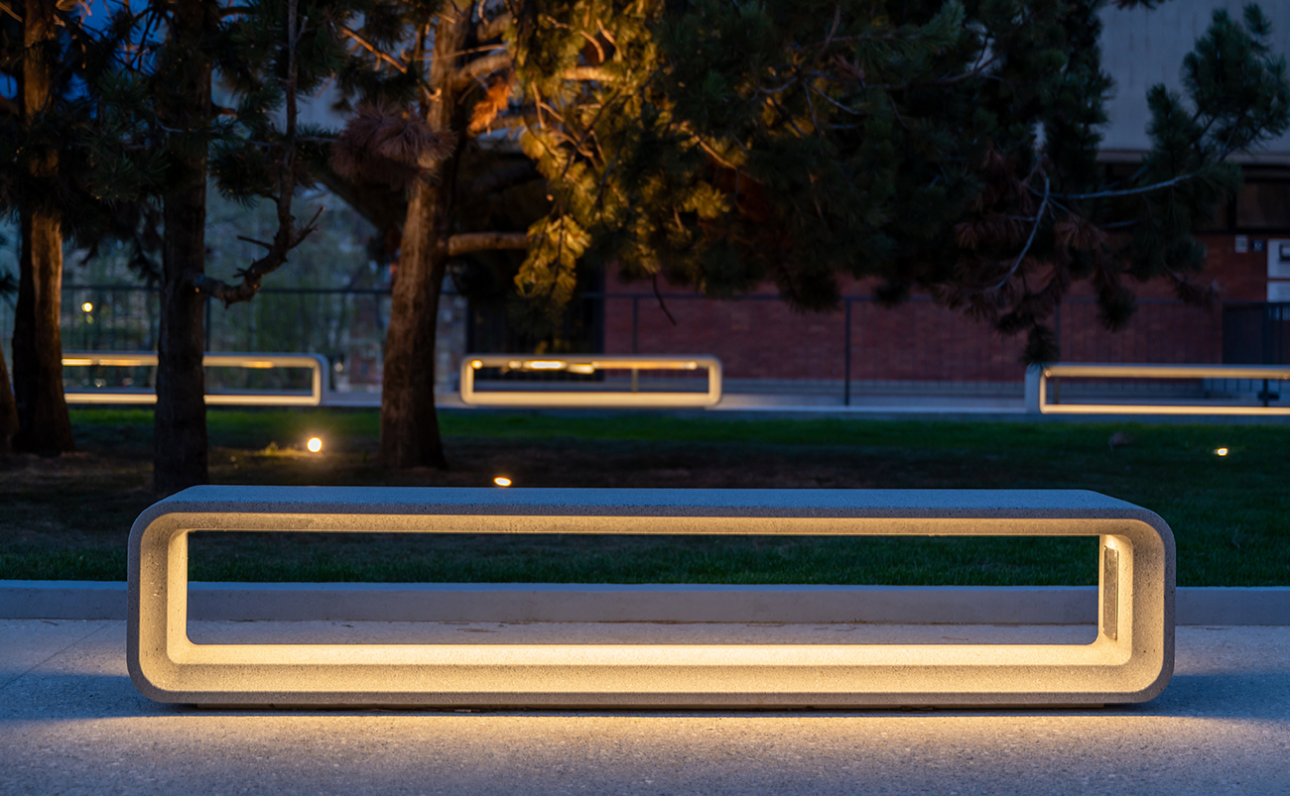
Colour doesn’t only matter during the day. In combination with a conscious lighting plan, a place can gain a 24‑hour identity; subtle, warm accents in darker areas and deliberate tone‑choices around benches and hand‑rails enhance the sense of safety and invite use even in the evening.
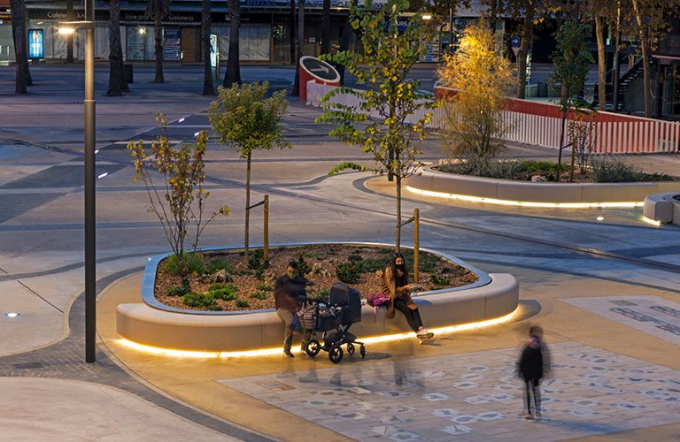
Ensure that key elements remain legible even under low light‑levels; combine colour with form, texture or pictograms so that information does not rely on a single signal. The ground plane contributes too: lighter walkways in a darker plaza guide pedestrians naturally, without extra signage. In the white paper we show how you can record this simply and reproducibly.
Colour and inclusion
Colour makes a place not only more attractive, but above all more understandable and usable for everyone. With predictable palettes and clear accents you reduce cognitive load; people read routes and functions more quickly and feel more confident. By making edges, hand‑rails and steps visible with sufficient luminance‑contrast you support physical accessibility, even at dusk or if tired.
Calm base‑tones, limited visual noise and matte finishes reduce stimuli and glare — which is beneficial for children, older people and anyone sensitive to busy environments. In this way colour contributes to inclusion in the broadest sense; in our Hub we show how you translate this into clear criteria and tender‑specifications.
Five recognisable scenarios
These five examples illustrate how colour works in different settings: from streets and shopping areas to squares, transport stops, campuses and school‑yards. Each scenario briefly outlines the starting situation, the choice that delivers immediate effect and a practical tip. See them as building‑blocks; you can combine accents from one scenario with the calm of another. Begin with the type of place and the behaviour you want; then choose a calm base‑palette with one recognisable accent colour.
Want to know why these choices work or how to embed them in tender‑specifications and maintenance? In our White paper “Colour that Performs” you’ll find the rationale and templates.
1. Street, boulevard or shopping district: colour for flow and stay
Long, linear streets and boulevards require rhythm and recognition; shopping streets also need subtle orientation and places to pause. With a consistent palette for benches, hand‑rails and bike racks you bring calm to the street scene, while recurring accents reinforce routes and crossings. Lighter tints on seating surfaces ensure more comfortable stay on sunny days; contrasting edges and details support way‑finding. In this way an attractive route emerges that improves both flow and linger‑quality.
2. Neighbourhood square: colour that invites
The square is correctly laid out, but feels flat and anonymous. By choosing a warm, light base‑palette for frames and seating surfaces, the square immediately acquires a friendlier character. Accent tones mark play‑elements and routes without being garish. The result: a place where people want to stay, with seating zones usable even in summer and a street‑scene that radiates coherence.
3. Campus or healthcare site: colour as identity and support
Outdoor spaces on a campus or healthcare site may quietly continue the building’s identity. With measured use of corporate‑colours on frames and guided accent colours for way‑finding, the environment becomes both recognisable and calm. In healthcare contexts, contrasting ends of arm‑rests and step‑points add extra support for vulnerable users. In this way you strengthen both orientation and comfort, without over‑stimulating the environment.
4. Transit zone (stop or station): colour that makes safety readable
Hubs are often busy and stimulus‑rich. A calm ground‑palette on large structures brings visual order, while clear contrast on contact surfaces such as hand‑rails, seating and edges increases readability. Choose one recognisable accent colour that recurs everywhere, so travellers intuitively know where to go. The area feels more organised and safer, even at dusk or in rain.
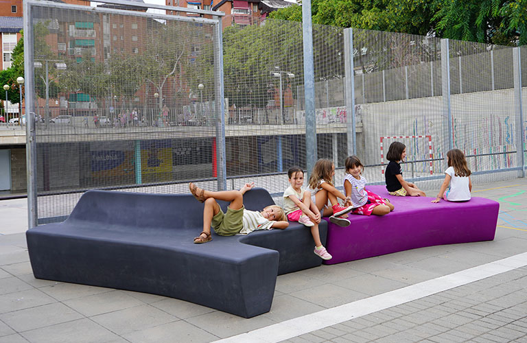
5. School or play‑yard: colour that guides behaviour
A school‑yard needs to be energetic yet manageable. By visually separating zones for play, rest and sport with clear accents on seating elements and ground surfaces, you steer behaviour without extra fencing or signage. Combine those accents with a calm base‑palette so the yard does not become too loud. The result is a dynamic, recognisable space where children play more safely and supervisors retain overview.
How to choose a suitable palette: three clear steps
1. Look at the place: Map use, pedestrian flows, shading and full sun. A shopping street demands a different rhythm than a neighbourhood square; a boulevard differs again from a campus.
2. Determine the role of colour: Do you want an accent for standout, a guide for way‑finding or calm to merge with the environment? In most cases a combination works: calm overall, and accents at decision‑points.
3. Fix it in place: Choose a base‑palette with two or three main tones and one accent; record colour names and codes and agree reorder‑ and maintenance procedures so the appearance remains consistent over time.
Want to know why these choices work? Go to our page “Colour that Performs: the Step‑by‑Step Guide” for the underpinning around contrast, cooling and maintenance. Or download our white paper on the use of colour in the public space
Frequently Asked Questions (compact)
Is colour mainly a matter of taste?
Taste plays a role, but colour also supports recognition, safety and comfort. With a few considered choices you can make an immediate difference. For the technical rationale we refer to our Hub.
Does light‑coloured furniture get dirty faster?
A good finish and clear maintenance routines make the difference. In the Hub you’ll find a checklist to manage this effectively.
How do I ensure consistency when re‑ordering?
Record colour names and codes plus batch‑numbers in a maintenance log‑book and coordinate this with your suppliers.
Which objects are included?
Benches, picnic tables, litter bins, bicycle racks, shelters and hand‑rails. One palette keeps the whole ensemble recognisable and calm.
Ready to Win Every Conversation on Colour with Confidence and Data?
Stop defending your designs on taste; start underpinning them with facts. The whitepaper “Colour that Performs” is your complete guide to turning colour into your most strategic design tool.
Further Reading
- • Discover the mostCommon Mistakes to Avoid to protect your next project.
- • Follow ourStep-by-Step Guide for a structured approach from context analysis to specification.
- Discover what the the most frequent made mistakes are in colour applications in the public realm..
Frequently Asked Questions (FAQ)
By shifting the conversation from subjective taste to measurable performance. The Servibo approach presents colour as a proven investment in social safety, liveability and smart management. This you can find fully detailed in our guide Colour that Performs.
Strong arguments are built on data and functionality: improved safety through better visibility, increased use and meeting behaviour, and intuitive wayfinding without signage. The Servibo method links these benefits to measurable indicators explained in the whitepaper.
The ROI (Return on Investment) is primarily social rather than financial. Gains include a higher sense of safety, stronger community identity and greater space utilisation. Servibo’s vision translates these soft benefits into hard arguments that policymakers understand.
Colour increases safety through contrast and clarity. Light colours and smart contrasts (LRV values) make obstacles and edges more visible, especially at dusk. A more readable, lively environment attracts people, enhancing informal social control, one of Servibo’s key insights.
Assign a consistent accent colour to a specific route or function. This creates intuitive, language-free guidance. Servibo’s strategy establishes a clear visual hierarchy within the palette, that is illustrated with practical examples in Colour that Performs.
Start with a thorough context and function analysis before choosing any colour. This avoids arbitrary decisions. The Servibo step-by-step method, from context to specification, offers a clear framework, explained in detail in the guide.
Other Questions?
Do you have additional questions or would you like personal advice on the application of add-on benches in your city or municipality? Our team is ready to think along with you and recommend the right solution. Click below on Contact Us and discover how together we can future-proof your public space.